Friday, March 24, 2023

Realism and Art Nouveau (Week 25)

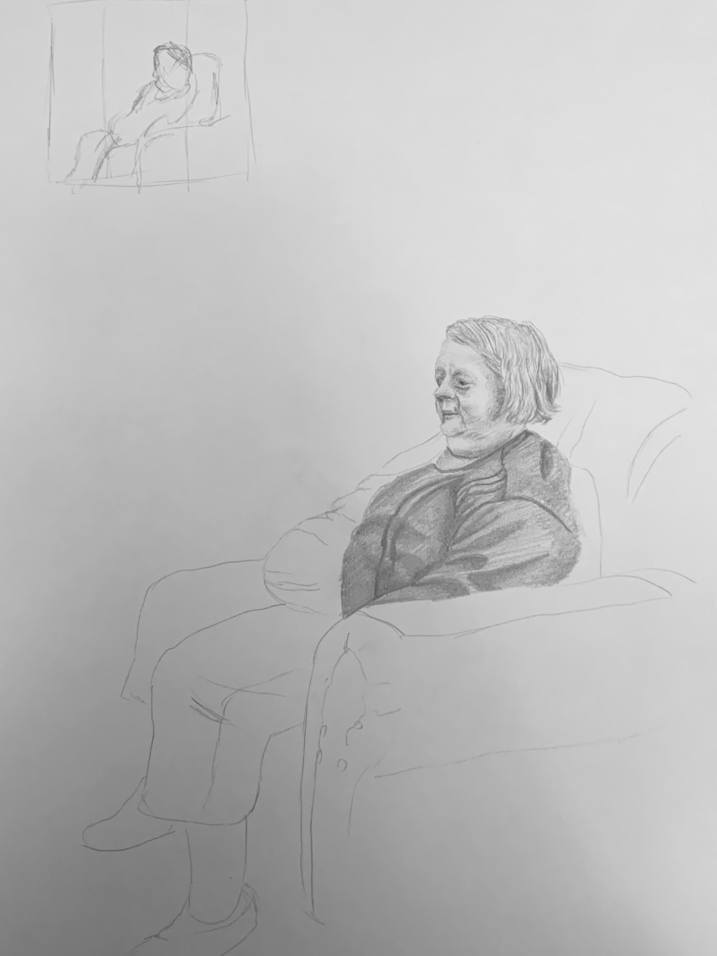
This week's focus was on using colour to get accurate representation of a model.

This week has helped me understand the importance of mixing colour to get tonal variation - I did use black in my piece to accent certain parts of the piece, but this was mainly to get the darkest parts or get folds within materials.

My colour palette was true to life, making use of cool and warm colours to justify a proper representation of what I could visually see, such as blue for the jeans and reds and yellows for skin tones. I believe it looks quite convincing proportionally, mainly because of the way the model is sat, however the use of shadows and highlights in certain areas helps the accurate portrayal of shape and form.

If I were to do this task again, I would probably sit at a different angle, mainly to make sure that I could do a full spread or get rid of most of the foreshortening problems I had when it came to doing this piece.


Friday, March 17, 2023

Classicism and Neoclassicism. Focus on Human Figure (Week 24)

This week's focus was on a sitting clothed figure.

I was ill for the session, so I decided to do my task from home - There was a good seating position to be found, given the amount of variety in clothing, along with the chairs being made of leather, I could help exemplify different aspects of the drawing.

I believe I managed to get some good tonal range, however, a lot more of it could have done with greater contrast, however, I wasn't too sure on how to build up the tone without adding extra pressure to the paper, as I didn't want to create any scratchy line work to the piece.

I think the hardest part of the task was trying to get the folds of the clothes while implementing a gradient to help it look like a smooth and natural transition to the other parts of the clothing - obviously some areas have great contrast between light and dark, however not every fold with have a contour highlight, making it look unrealistic under the lighting.

If I could have done anything different for the task, I would definitely have drawn at a slightly different angle to help better represent the 3/4 view.


Saturday, March 11, 2023

Muscle Structure. Combining Black and Colour Media (Week 23)

I believe this week has been the most challenging week so far this term - this is mainly due to my restricted resources. I used prismacolour pencils, but I had to share with a peer who didn't have materials, which made getting hold of specific colours hard when they were elsewhere, in use.
Furthermore, trying to control the charcoal without smudging was also a difficult task.
However, using the charcoal can help give a defined shape which can hold an understanding of how muscles are formed.

Aside from all this, I believe I achieved accurate shape and proportions in my sketch but If I were to do anything differently in this task, I probably would have used a thicker medium like pastel in order to get my suggestive and expressive line work and to help the dark and lighter values blend better together.


Saturday, February 25, 2023

Enhancement week (Week 22)

For this week's contextual task, I wanted to focus on describing work.

I chose Jing Hao - Mount Kuang Lu.

Jing has used several techniques with ink, there seems to be an ink wash used where water is on the right hand side of the piece, you can tell this by the slight off colour that is generated, compared to other darker areas of the piece.

In built up areas, like the tree, there seems to be the use of mixed short cross hatching, which helps define the shape and build up tone in these areas. In the mountain areas of the piece, the effect almost looks like a scroll pen (though they weren't invented) the singular lines that go down the page in a uniform fashion is reminiscent of how a scroll pen would feel.

With areas of intense frequency, it seems a stippling effect has been used - to create objects like bushes, in order to give a very compact feeling to this area. This is most notable in the centre of the page where foliage seems more compact, furthermore, values in these areas are a lot darker compared to other parts of the piece, because of how close the foliage is in proximity to one another, additionally, clouds have been represented by white streams through the page, which could have been put there while the ink was drying, gradually removing certain ink areas for this desired effect.

Jing Hao: Mount Kuanglu (960–1279) China Online Museum. Available at: https://www.comuseum.com/product/jing-hao-mount-kuanglu/ (Accessed: February 25, 2023).


Friday, February 24, 2023

Human Body Dynamics. Using Indian Ink and Ink Washes (Week 21)

This week's task was focused on inks, this week's work was quite challenging, mainly because with ink, there is no way to reverse the marks you have made, so it requires you to be accurate first try.

I found with this task that shading everything that isn't highlight, or shading a darker tone around the white paper (where the highlight would be) creates form quite effectively. Understanding the human figure with this task has made me realise how important it is to add muscle definition to define form, it helped me add shadows where muscle groups are and makes it fully realised.

I believe the poses in my work are quite gestural and effective, however, if I could change something about this work, I would definitely try to water down my ink more and build up the tone.


Friday, February 17, 2023

Nude Figure on Black Paper (Week 20)

This week's focus was on a nude figure on black paper.

Overall, I really enjoyed this week's task, the measuring for this week's work was very strong, however, one thing that was pointed out to me, when I initially drew the piece, the legs were foreshortened incorrectly, especially the foot, making it a bit too small for what it is.

Another catch I hit was when I was brought up on the tones not equally blending together, resulting in blocks of black still visible on the paper underneath.

Using the black paper was useful to reverse the polarity in terms of shading, doing the highlights rather than the shadows like on regular graphite pieces.

I believe I managed to capture the muscle definition quite well, though the piece needs finishing, I managed to capture the arm muscles particularly well, analysing the contour of shapes within the body.

However, if I had to do the task differently, I would probably try to sharpen my materials more, in order to work in the tone more accurately, half the problem was having a dull/blunt material to work with.


Friday, February 10, 2023

Focus on Anatomy (Week 19)

This week's focus was on the anatomy.

For my drawings, I decided to alternate between red and blue pencil, this was to help me gain confidence with my lines and make the pencil have less smudge properties compared to normal graphite.

This exercise has helped me develop my understanding of anatomy because I measured each piece using the Andrew Loomis method of measurement.

I think the strongest piece was the red sitting pose piece, I choose this one specifically because the first 2 drawings seemed to be 'practice' sketches rather than fully realised pieces - so as I progressed, the pieces' quality increased.

I used the side of the pencils to define the shape of important parts of the body as well as including shadows, which in turn makes for a relatively convincing final outcome.

If I were to improve on anything, I would probably try and pick up on the lighting scenario a bit more, making my shading a bit more obvious, as lighting could also help to identify structure.


Friday, February 3, 2023

Impressionism and Post Impressionism. Portrait in Cold and Warm Colours (Week 18) (Contextual task)

For this contextual task, I wanted to focus on Pierre-Auguste Renoir self portrait.

The way the colour has been used to emphasise material and identify what shade and tone it actually is can be seen well on this piece.

A very dark blue has been used for the main body of the clothes, as you can use blue to get the darkest tones without using black.

Another key observation is bounce light - on his jacket collar and hat, you can clearly see defined lighting of the background, represented by the cream-brown colour, additionally to accent certain features, some properties like subsurface can be seen in combination with the lighting scenario.

The beard on his top lip shows this, where the yellow can be seen in replacement to the white which would otherwise be there under other lighting conditions.

I really like the atmosphere that the piece creates. The way the lighting is set up helps the artist identify the underlying structure of the scull, where the eyes sink in, the jaw bone protrudes, etc. Furthermore giving accents to certain features in order to enhance them, for example the white collar or tie, short mark making has emphasised a thin material and highlight which defines the shape.


Impressionism and Post Impressionism. Portrait in Cold and Warm Colours (Week 18)

This week's focus was ensuring we could combine our use of colour.

My approach was doing shadows in cooler tones and midtones in warmer colours.

Some initial problems I had were the eyes, it was hard to get a defined structure - another setback that didn't help were the pencils I used, I had a set of prismacolor, which are high quality, but I was a bit anxious to actually commit to any form definition due to the fact the pencil didn't erase easily, if at all.

But overall, when I started to plot in the colour and work my way through, I realised that adding higher contrast to the piece worked and it shows in the most recent result.

I would say overall, I am good at identifying colour and applying it, but the actual committing to placing down form and anatomy is a bit rocky and I would like to continue to improve this.


Friday, January 27, 2023

Composition in Portrait: Colour Aesthetics and Drawing Techniques (Week 17)


This week's focus was on colour pieces for our final outcomes.

Believing I didn't have enough time to do the task - I did 2 examples, drawing both my parents, one i warm and one in cool, however, I took it upon myself to do a 3rd in class, where I used tone paper.

The tone paper was very useful as it allowed for great blending of colours, especially by smudging with a smudge stick, overall, the colours in this piece turned out well, although, I initially had difficulty trying to get the form and structure of the face, one of the main things that was pointed out was the eyes being too wide and far apart from each other, I ended up rectifying this later on.

The colour outcomes set a mood, the warm portrait seems more inviting and gives off a loving vibe, whereas the cooler colours set a darker tone, additionally, the way I drew the subjects at different angles helps contrast the two portraits.


Friday, January 20, 2023

Renaissance and the Golden Dutch Age. Focus on Portrait (Week 16 - Contextual task)

For my analysis, I decided to go with Rembrandt, self portrait.

This painting is a staple of the Dutch golden age.

Overall, the quality of the painting has great likeness, as well as composition - you could argue that this painting specifically lines up with the rule of 3rds style of composition, furthermore, you could possibly see your eye being drawn from the corner of the page (bottom right) up the clothes and circle around the face, taking in the colours.

This is because, everything in the piece is brown in colour, so even though the face isn't far off in terms of colour, it is lighter and therefore captures the viewers eye a lot more compared to say if it was a darker colour.

Given these colours, this could describe Rembrandt's personality as striking, or potentially god like in terms of the colours use - as yellow/golden colours are often associated with higher powers or royalty and the way it is portrayed in the image helps reinforce that ideal.


Renaissance and the Golden Dutch Age. Focus on Portrait (Week 16)

This week's focus was on shading techniques and getting the form of the head via tonal value build up rather than constructive line work.

Overall, the piece went well, however, I am still having issue with shading and correctly demonstrating techniques relating to rendering.

I managed to maintain a good composition and get a clearly identifiable face with the tonal values I used - But this can be improved on in the future, the main problems I have had were pretty much the same as what I had in last week's drawing session.

I seem to be getting overall likeness and succeeding in constructing the face, but it is the overall structure via rendering that is a core component being off in the pieces.


Friday, January 13, 2023

Human Head Construction. Part 3 – The Human Face (Week 15)

This week we were tasked with drawing the human face.

Overall, for me it was initially hard to start the piece, because when drawing anatomy, it is hard for me to gauge measurements in proportion. However, as I progressed through the piece and started to add tonal value, the work improved.

The most difficult part was getting accurate details, due to Rex's darker skin tone, it was difficult to see where some features started and ended. Most notable was the left eye, it was difficult for me to see the contrast between the background behind him and where the face ended, additionally, him having brown eyes also made it difficult to distinguish where the contour was.

But overall, I would like to take my tonal value forward and improve this, I think that brining this to the forefront would help bring out features and contour in order to get a like-for-like representation.

The basic tonal render is there, giving a good understanding of the form, however, this could be improved upon, as previously mentioned. Whether it is the paper or the pencils I am using, the overall build-up seems a bit rough, however, this could be the technique I am using. What the rendering quality lacks, makes up for in understanding where the lighting of the piece is coming from.


Saturday, December 3, 2022

Traditional Art practice: Reinforcing skills - Still Life with a Skull / Plaster Head (Week 9)

This week's focus revolved around plaster head/skull studies with still life.

I decided to pick the skull still life as this reflected my work of past weeks, which was really strong, believing that my skull final render was stronger than my plaster head final render.

Additionally, having more organic objects, i.e: the flowers, in this composition helped me have different value changes and focus on different shading techniques such as circling, basic shading and shading outside the object.

The thing I found most difficult about this task was getting the book to be the darkest value, I had to use a graphite 9B pencil to get my effect due to taking a long time to build up the tone, furthermore, it took a really long time to erase too, however the result paid off nicely, giving it reflections, indicating a glossy/satin object and giving it nice detail.

If I were to do anything differently, I would focus on trying to nail down all the main details, specifically on the skull, this way I wouldn't have to focus too much on incorporating this into my render and block shading.

Overall, this term I have learned how to efficiently render objects, which has improved a lot since last year. Moreover, it has shown me the importance of drawing things accurately, which, in turn, shows me that drawing things inaccurately does not make the overall composition or final render look how it is supposed to when it is finished and can be jarring when the perspective of something isn't correct.